If you pay close attention to the appearance of an interviewee, you can easily guess the position he would have been applied for. No special HR Management degree is required for that.
- A marketing professional will turn up in a well-ironed, nicely-tailored shirt, trousers, and probably a tie.
- He stands tall, with the most pleasant smile.
- He is eager to shake hands and introduce himself in a convincing style.
Conversely, it’s not unusual for software engineer applicants to show up in
- “business casual,” a plain, simple shirt, trousers, or even jeans.
- They feel blessed to meet the usually polite HR recruiters.
- Take a good look at the surroundings and use a general answer of “yes” to the typical behavioral competency questions.
The presentation of the applicants of these two profiles is completely different, yet well-suited to their roles.
You can find the same difference in the design of a website.
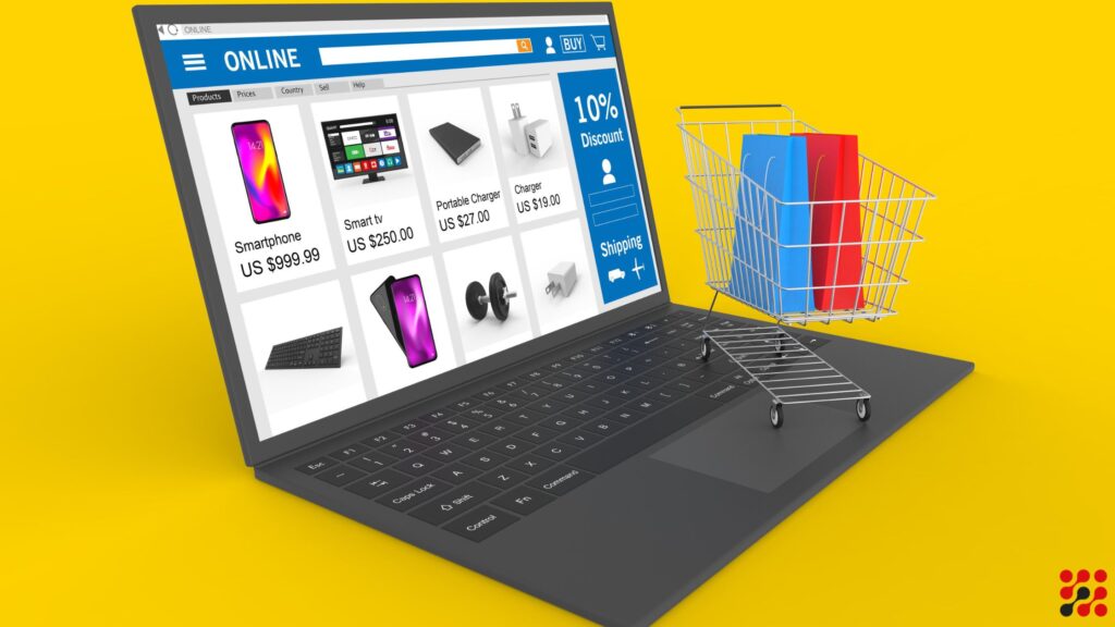
- A manufacturing company’s website design is totally different from an e-commerce website.
- Where a business to business (B2B) website appears simple like a software engineer.
- The business to consumer (B2C) website looks more like those marketing and sales types with a pleasant smile. The eagerness to shake hands is evident with those constant pop-ups asking for your email address and phone numbers.
But beyond these apparent differences based on the industry and the purpose of a website, there are similarities too. The most common ones are a presentable look and easy navigation. Just like an interview, no matter which position you have applied for, you need to look presentable and ensure excellent communication. For a website, it is important that it effectively communicates with its users.
Below, we explore the top five website designing tips that help a website effectively convey a message to the users and enable them to take the desired action.
1. Clean and Clutter-Free:
With a clean and clutter-free look, the needs and desires of your website, visitors should be fully served. Analyze what they are looking for on your website; information, entertainment, business discussion, any kind of interaction, or shopping.
Design a goal-specific website. It is recommended to stick to the basic requirement rather than giving up to the alluring technologies and focusing on them, which do not solve the purpose or are simply unimportant.
Web users want information quickly. For this, a website needs to be organized properly. Categorize the headings and sub-headings, and keep the names of the category clear and simple. Heading and sub-headings should be industry or user-specific.
2. Use of Visual Hierarchy:
Website designing at the core is about communication. As a website designer, you need to effectively and quickly communicate the ideas and information to the users, or else you may lose them.
Remember that people are visual-thinkers and not data processors. They cannot hold more than seven items a page. So, rather than giving massive information in one dose, break down the information into tiny chunks, with appealing visuals. The simplest way to arrange those chunks is by keeping the important messages of the webpage at the beginning and call-to-action at the end.
Color contrast and alignment are the pillars of the visual hierarchy. Where color contrast helps in creating harmony and shift focus, alignment establishes the order in the hierarchical roles.
3. Balanced Color-Combination:
Colors solve the purpose of the website designers in two ways: first, in creating the emotional effect and second, by emphasizing the important message.
Notice that most of the finance companies use blue and white colors, healthcare companies play with the shades of green color, food and beverage companies use bright orange and yellow colors, and cosmetics companies choose red, white, and black colors.
Select the colors which are easy on the eyes and deliver the most important message in a pleasing way.
4. Readable Font For Your Website:
Calligraphy is an ancient craft. In the era of computers and digital communication, it has been replaced with typography.
I would suggest that a website designer not experiment here just to remove your Helvetica hangover. You can take your chances, though.
The good thing about Helvetica is it is readable and looks good in both small and large sizes. The size of the text can also be increased and decreased to emphasize the amount of importance you want to give to the text.
5. Mobile-friendly:
You create a website to open another platform for your users from your brick-and-mortar shop. Add more channels to this platform so as to provide anytime-anywhere access to them.
Most of the prominent website designing companies provide an omnichannel solution for your website. There are several technological and user interface factors that are needed to be taken care of while creating a mobile-friendly website. Pick a website designing and development service provider that has vast experience in designing websites for mobiles of different operating systems.
I hope the article will help you in effectively designing the website to achieve a more presentable look. We will cover additional traits of a professional website that you might be interested in.


